Info:
· Home
· Youtube
· Contact
· About
· What's New!
Galleries:
· Big Art
· Bridges
· Maine
· SF & HPS
· Early Work
· Timepieces
· Walden
Highlights:
· Overview
· Ancient
· Animation
· Buddhas
· Books
· Walden Pond
· Tarot
Writing:
· True Stories
· Murals
· Poetry
· Middle English
· Blue Teapot
Manifesto

Murals
~ · ~ · ~ · ~ · ~ · ~ · ~ · ~ · ~ · ~
Tanya's huge mural, "Can You See It From The Moon,"
has a starring role in her video
An Artist's Romance With San Francisco,
now on youtube.
· Allen House, my first mural
· In the Kitchen, a mural at Hunters Point Shipyard
· Amateur Artists Day, in the lands east of San Francisco
· Through the Tunnel to Honey Hill, a residential mural
· Mural Painting at Cowden Automotive, in a business setting
· Can You See It From the Moon
· Getting the Word Out
· Ongoing and Upcoming
~ · ~ · ~ · ~ · ~ · ~ · ~ · ~ · ~ · ~
Through the Tunnel to Honey Hill
My next mural was a direct result of participating in open studio events. A mother and daughter came to San Francisco open studios and signed my shipyard guest book. At the time, they didn't talk to me. They were names and addresses without individuality, but with a simple and cultured handwriting I liked.
As I worked on my following open studio promotional material, I fell victim to a sequence of thoughts that often afflicts us artists.
"Why am I bothering to do this, anyway?"
"What good will it do?"
These are questions we ask ourselves when we haven't gotten much feedback about pieces we exhibit and when sales haven't hit the TV game show jackpots of our imaginations. Sometimes we haven't sold anything at all for considerable lengths of time.
I stuffed envelopes, slapped on labels, added stamps, having no answer to my own questions except, "I'm going to go ahead and do this."
The open studio event I was announcing at the time was smaller and more off the beaten track than open studios in San Francisco. Yet I generally sold as much or more at these smaller events. All the same, I worried I might not sell anything this time.
"Seal the envelopes. Just go for it," I told myself.
The mother and daughter with the handwriting I liked came. So did the rest of the family, father and son. I was impressed because I enjoy children and young people being part of these events.
The family told me they liked my flower paintings in watercolor. They had space for a mural near their front door and wanted to discuss my designing something for them. I envisioned an ordinary size door with space behind it approximately the size of the door itself. With this in mind, I put together a portfolio of possible subjects and went to see the site. I drove through the Caldecott Tunnel into the rolling contours of East Contra Costa County and turned off at Honey Hill. Directions I had been given were good. After a few zigzags, up some slopes, and down others, I found the house and had enjoyed the ride.
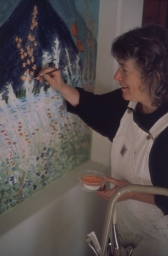
Tanya at work on
the residential
Mt. Tamalpais Mural.
Photo: Ami DeAvillaThe front door was large and gracious. Windows of beveled glass flanked it, projecting a warm light into the foyer. Across the foyer from the front door was a recessed area 8 feet high and 12 feet long specially allocated for a mural. To the left of the mural space was a living room, dining room to the right. I could see a family room past the living room. Later I was shown the kitchen, behind the mural space.
A nature subject was the topic under discussion. 8 feet by 12 feet gave room for something dramatic. The composition needed to work both from close up and from a distance. Walking from room to room through the foyer, one could be as close as a foot or two from the painted surface. The mural would also be visible from the living room, dining room, and from the entrance patio outside.
My worst fear about a commissioned piece is getting half way or more through and hearing, "It's not quite what we had in mind." As it turned out, I had no need to worry. My clients were clear and decisive. It had been a long time since I'd heard, "It isn't quite what we had in mind," a long time since I was a brash young thing who knew what good art was and couldn't wait to shove it down the throats of the philistine general population for their own good.
Happily for all, those student days were ancient history, though I wanted to make sure we were all on the same wave length about this new venture. Any time a person describes visual art in words there is a translation process. The words aren't the same thing as the original. No matter how sympatico the words are, images in the mind of a person describing a painting will be different from images the words create for people listening.
I painted ten nine inch by twelve inch sketches and asked the family to pick out two or three for possible development. They picked two, both of Mt. Tamalpais, where they hiked.
Next I worked up three 22 inch by 30 inch versions of the these compositions, settling on views of Mt. Tam seen from the East Bay Hills above the Caldecott Tunnel with a bit of San Francisco Bay included. The three versions varied in color and foreground details. My clients picked one and we were under way.
I decided on a foreground of California wildflowers, so that if you were close to the mural it would be almost as though you were strolling or lying down among the plants. I enlarged my sketches freehand from notes on proportion. Working freehand, I could tailor the composition to the variety of angles from which the finished mural would be seen.
For durability, I was working in acrylic. I put three coats of thinned acrylic gesso on the wall first as an undercoat, wondering, as I brushed on the uniform white layers, how I was going to translate the delicacy of watercolor (watercolor influenced by Chinese and Japanese brush strokes) into the tougher, thicker medium of acrylic.
I began blocking in the composition with a pale blue I'd mixed for the sky. I still had no idea how I was going to create the watercolor effect. Being a creature brought up not to waste materials, I made the pale blue by adding a little blue acrylic and water to leftover thinned gesso I'd used for the undercoat. I chose "gesso with grounds" to provide a little texture.
Bingo! Color added to the thinned gesso gave a bit of translucency, just enough to provide the feel of watercolor. Now I felt I was truly off to a flying start!
We agreed on most of my color choices. I'd decided, though my clients didn't require it, that I wanted all the plants in the mural to be California natives. I'd included a yellow evening primrose, dramatically tall, at the left. But one of the major decision makers in the family didn't like yellow. I hadn't taken his objection to yellow seriously and, as details of the composition began to develop, he reiterated his objection in no uncertain terms.
I decided on spikes of blue echium to replace the offending yellow. I could have used blue ceonothus to keep to my native plant theme, but I wanted the drama of echium spikes. I wasn't far into the painting. The change was remarkably easy.
Butterflies were to be included. I put in two orange ones and two yellow ones. Against the green hills of California in spring, and with a verigated foreground, two butterflies had to be yellow swallowtails in order to stand out. Agreement was reached.
There was no other disagreement about form, color, or composition. The mural took approximately three months of working three afternoons a week. I enjoyed every minute of it. Someone was always available to lend a helping hand and every so often to put some jazz on the stereo. My clients sometimes worked at home. One day we had tea together. On another day someone drew my attention to a family of deer in the garden, including a buck, who came through the yard about four p.m. Landscaping, in shades of purple, red, and orange, was as deerproof as possible.
The children and their friends commented on the mural occasionally as they came in from school. So did the housekeepers, whose Latin heritage gave them a special attentiveness to painting on walls. The father of one client and the mom of the other visited. I enjoyed everyone and also wanted to keep the whole family talking with me so that if there was any real dissatisfaction it could be addressed as it arose.
A requirement I found taxing at the start was that my work space be completely cleaned up each day as the mural progressed. The house had had construction going on for so long no one in the family wanted to look at drop cloths and ladders when work was not literally underway. I was not thrilled by this request, but the discipline of carrying it out served me well on my next mural project at Cowden Automotive. There, I had to clean up. The shop did not include room to leave my paints out at the base of the mural. I kept them in an attic balcony that overlooked the main floor of the shop, a great place to get a view of the mural and to have a few moments of quiet contemplation. By the time I was working on the Cowden mural, cleaning up every day, stowing ladders, and so forth had become second nature and life was better for it.
One day when I was about half finished with the mural of Mt. Tamalpais and wildflowers, one of my clients asked me how I liked working on a large scale. I had not thought about it consciously.
"I love it!" I told him spontaneously from up on my ladder. As I continued to paint, I reflected on my own answer. "Yes! I love it!" The broad gesture, the space, the variations that happen visually when I step back. "I love it!"
My clients were excited about how the mural seems to change when seen from extreme left or right. The effect is as though a viewer were driving by a mountain. The contours of peaks, ridges, and declivities appear to change as we go past at speeds faster than the pace of walking. It was an exciting experience to see this happen with changes in proximity to the mural. From left in the living room or right in the dining room the scene is different. From outside in the entrance patio it is yet different again. These effects pleased us all. They are one of the major aspects of painting in large scale.
Two Tibetan rugs in the foyer had to be rolled up at the start of work each day and unrolled again when work stopped. Under each rug was a useful, but unruly, foam mat. My clients often helped with the rolling up and unrolling, getting the unruly mats square with the rugs so the mats didn't show. The mat color was an emerald green of which I am fond. I use it often in watercolor paintings for subtle morning skies and rich farmland vegetation. However, this green didn't go with the rugs, the mural, or the flagstone and wood floor, so we were highly motivated to get the mats squared up and hidden.
While I was beginning concerted work on the foreground of the mural, my clients told me they wanted the mural to pick up colors from the rugs. This request was expressed with some firmness. Once expressed, I considered it a command. Some correspondences were already there: red zauschneria, blue brodiaea, orange mimulus, deep green foliage. But the rugs included predominant areas of rich reddish brown. What plant is reddish brown? What healthy California native plant, that is.
My use of California natives was admittedly a game I was playing with myself. My selection of specific plants was open ended from my clients' point of view. All the same, I went home and paced the floor like a caged animal. "Pick up the colors of the rugs? Oh, brother!" The more I paced the farther I seemed to be from a solution.
Three days later the answer came to me: buckwheat! Buckwheat flowers can be white, pink, or reddish brown! A rich reddish brown called brown madder in watercolor and very like the reddish browns in the rugs!! The buckwheat worked.
I began actual painting of the mural in the autumn and said I'd be done a few days before Christmas, or, by Christmas I'd be close enough to done that the mural would look finished for holiday entertaining and I could come back in January to add final touches. A day or two before the holiday deadline I had set I realized I was finished. My clients weren't so sure. Part of the foreground didn't seem settled from their point of view.
We agreed that they would think about it over the weekend. The next work day when I arrived, I saw that one of my clients was busy on the phone, so I went out in the garden to eat my lunch, thinking I could do a completely new and different composition using plants from this garden, especially rich purple hybrid penstamons, a flower I am fond of. After a while, one of my clients came out and told me they had decided the mural was finished. He had a special spark in his eye and a purposeful smile.
"We didn't really expect to get colors that would pick up the Tibetan rugs," he said, acknowledging how well he'd played his cards. I recalled the firmness of his initial request and was wryly amused that I had taken the request as a command. However, I'd come through with flying colors for both of us! I'm not fond of games or sports for which the rules can be described before play begins. But this sport, The Game of the Tibetan Rugs, was right up my alley, as is the idea of activities in which everyone wins!
We all agreed that we had very much liked working together. During the final days of my painting on the mural I'd brought with me a brochure about the narthex (foyer) Larry Boyce had painted in one of San Francisco's churches. Boyce was one of the first contemporary artists to study nineteenth century decorative painting techniques. He was a leader in reintroducing them to modern restoration projects. I'd been fortunate enough to meet him at a Victorian Alliance Christmas party early in his career. The brochure interested me in itself, because I had met Boyce, and because his work glows with richness appropriate to the spaces where it is used. The brochure also interested me because it talked about how Boyce had done this narthex ceiling. My clients for the Mt. Tamalpais mural wanted me to write something similar about their mural.
I was too close to the project at the time to know where to begin. Or, more specifically, I did begin, but I didn't really get anywhere until questions people asked about the Cowden Automotive mural helped me focus my thought so that I could write about my mural painting generally.
Considerable candor on my Honey Hill clients' part was involved in telling me they hadn't really expected to get colors that picked up tones in the Tibetan rugs. Some candor on my part is involved in this writing. With a warm smile, I offer it to Joe, Robin, Erin, and Ryan.
~ · ~ · ~ · ~ · ~ · ~ · ~ · ~ · ~ · ~